Watermark Designs
Sample 1
Picture 1
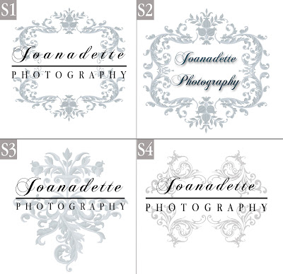
Hey guys, here are a few Watermarks that I have designed. Haha...okay...modified. All the designs were cut and some were stretched so it won't look like the original. (Except S3). Had a hard time trying to figure out how to modify that one.
The one in Sample 1 (S2) is the same one from my previous post. The one below it (S4) is actually a combination of 4 duplicates of the same pattern. It almost looks butterfly-like. I had a dilemma in choosing which watermark is the better one. It was between S1 and S4. How it comes out when placed in the picture (P2 and P4) is very clean, simple and the wordings are more visible (readable).
Hehe... I can use a couple of feedback or suggestions. Either that or you guys will see which of these designs will be used in my next post. =P


I am quite inclined towards the 4th one. Easier to read =)
ReplyDeleteJace! Haha...cool. Thanks. I like the 4th one too. Somehow. Still browsing for more designs. =)
ReplyDelete